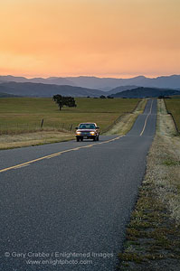
 Picture: Pickup truck driving on a long straight rolling hills country road at sunrise, near Santa Ynez, Santa Barbara County, California
Sometimes you just have a feeling about a photo as you’re taking the shot. For instance, knowing it would make for a perfect cover photo.
Cover photos are usually not the perfect composition you’d normally see as a print on a wall. Often publishers will want extra negative (blank) space at the top of the frame to accomodate their title. Magazines also like the primary subject to be near the center or slightly higher, so the subject will still be visible when sitting in an upright magazine rack. They also like some extra room to put the text of what will be featured that month, or some kind of lead in slug that will make you want to find out more about what’s inside.
Click here to see a perfect example.

Ha! Nice one.
That’s hilarious Gary. If I had a 4Runner, I’d probably feel the same way!
That is funny stuff Gary!
This image would make a great cover.
Ron