Would you clone out a few unwanted objects in your landscape photos? Is it OK, and are there times when you shouldn’t alter your photos?
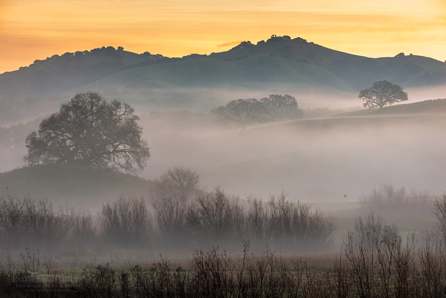
Photo: (Above) Morning mist in the Alhambra Valley, Contra Costa County, California Purchase Prints or License Usage.
Photography is an art form, and in ART, all things are fair game. But photography can also be a truthful editorial representation of a scene, especially when it comes to landscape, travel, or nature photos. To set the spectrum, not many people will think twice using a clone tool to get rid of a stray hair or freckle from a model, but in photojournalism, even that minute fix crosses an ethical line in the sand. I know photo editors who will say you that for some wildlife publications, you shouldn’t even clone out a distracting twig. While many of us might not think such strict ethical guidelines are required, I’m curious where you might put that shifting gray line in the sand.
I recently captured this wonderful misty morning sunrise shot in the Alhambra Valley not too far from where I live. When I got all the images uploaded into Lightroom and previewed at 100%, I noticed a few details that I didn’t see when I was taking the photo. Had I noticed these few undesired elements while in the field, I can safely say it wouldn’t have stopped me from taking the photo, especially since it wasn’t really possible to recompose the shot.
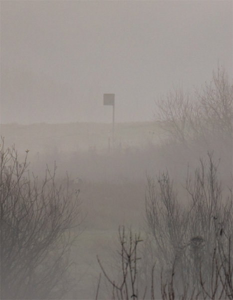
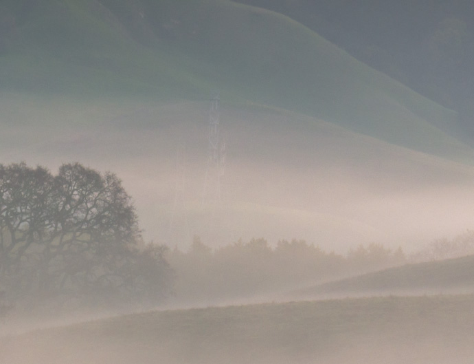
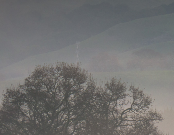
The first most obvious element is this lone ‘flag-like’ object in the near-mid-ground. My guess is that it might be a bird box. The other objects in the background aren’t as visible but are much more permanent physical structures, namely high-tension electrical towers.
For myself, thinking for a fine art print of this image, it seems like it should be a no-brainer: Get rid of the ugly stuff.
But what happens when someone sees your image — of whatever it may be — and wants to get their own version. Arriving at the location they suddenly notice a large structure that didn’t exist in your image, i.e., power poles, smokestacks, a house, etc.. Is there an internal or ethical price or penalty we pay when we choose to erase things out of a photo when we’re trying to present that something as the way it really looked?
For myself, I think my editorial background seems to dictate that the electrical towers will have to stay. They are fairly discrete thanks to the mist partially obscuring them. However, I wrestle a bit more with the tiny but highly visible bird box. It’s not such a permanent item and it could easily be cloned out. In my workshops, I often talk about visual weights within images, even for very small objects. This little black square has a pretty strong visual weight. It definitely catches one’s eye and forces one to visually stop there for a moment. That could be a good or bad thing, but I’m still not sure which. I’d love to hear your opinion.
What you would do if this was your shot; would you choose to clone out all, some, or none of these objects, and why?
Thanks in advance for sharing any thoughts with me in private or through the comment box below.
– Gary. 🙂
![]()
—
 Gary Crabbe is an award-winning commercial and editorial outdoor travel photographer and author based out of the San Francisco Bay Area, California. He has seven published books on California to his credit, including “Photographing California; v1-North”, which won the prestigious 2013 IBPA Benjamin Franklin Gold Medal award as Best Regional title. His client and publication credits include the National Geographic Society, the New York Times, Forbes Magazine, TIME, The North Face, Subaru, L.L. Bean, Victoria’s Secret, Sunset Magazine, The Nature Conservancy, and many more. Gary is also a photography instructor and consultant, offering both public and private photo workshops. He also works occasionally a professional freelance Photo Editor.
Follow me on FACEBOOK – INSTAGRAM – TWITTER
*** If you like this post, I would greatly appreciate it if you’d consider sharing this with your friends using one of the Social Media sharing buttons located at the top or bottom of this post. You can also sign up to receive free updates by email when future posts are made to this blog.
![]()


I did not notice the electrical towers, but I did notice the little bird box right away. Compositionally, it sits at a crucial point in the photo. What positive effect could the attention that it draws possibly have? There is none to me. It is a distraction just like sensor dust, and I would not hesitate to clone it away (if it isn’t a documentary photo, as you stated). As for anyone else who makes a similar photo at this location: they will make it their own – this is yours, and you can do what you want with it. 🙂
I agree, the bird box has to go. It’s aesthetically displeasing and it’s unnecessarily distracting. The towers can stay; you hardly see them anyway, and they’re “lost in the mist” which almost sorta adds to the image and its atmosphere.
I don’t agree that nature/landscape photography is necessarily documentary. Basically, I think it comes down to your reason for making the image in the first place: if you’re illustrating some environmental issue or man’s impact on nature then yes, of course, it’s documentary and should be strictly untouched; if you’re making an “art” image then limited retouching to better align with your inner vision is perfectly ok. It’s not as though no-one ever retouched a negative or print back in the day. Also it depends on who you’re making the image for: if you’re on assignment for that editor at a big nature magazine, then I guess you don’t edit out the twig. If you’re out shooting purely to add to your portfolio then you follow your own rules. I’m of the opinion that any post processing, including retouching, should be minimal, but the bird box definitely falls in the “lose it” category!
As for people not finding an exact copy to reproduce… tough. Likely they won’t have your exact coordinates, and if they do, well, there are never any guarantees. Trees can be cut down, rocks can fall, flash floods can cause devastation, landowners can put up fences or towers… So it goes. And let’s face it, people should be looking to make their own images, not copy someone else’s.
So do whatever your gut tells you, Gary. The “eyes” have it. 😉
I’m a rebel I guess, but I like the birdhouse. Normally I do not care for man-made objects in Landscapes, but it fits the pastoral scene. I didn’t notice the power poles right away, I do have an allergy to power lines in photos. 🙂
As for the bigger question, it depends what you’re calling your photography. If you’re branding yourself as a documentarian, photojournalist, etc, then I do object to cloning and adding and compositing beyond exposure blending.
If you’re branding yourself as an artist – anything goes!
In the middle is Landscape Photography. Personally, if using that name I prefer to err on the side of purity, at least as far as elements in the frame.
I always throw a basic question to the situation – is the unwanted feature a significant part of the environment or habitat in relation to the message of the photograph?
So things like power lines or something I either didn’t notice, or would do more harm in the field to avoid it, I don’t see any issue personally. I think removing objects has some degree of grey, however adding things in that were not there at the moment is an entirely different situation.
Ansel Adams took five years to get Moonrise Hernandez right. In the end he actually took out a cloud. If Ansel did it, so can we. I have no problem in creating the image I want by whatever means I have. It is not your image, it is my vision, and that is what I am sharing with all of my photography.
I believe that it is up to the artist that is taking the shot to determine where that line is. There are a lot that “Manufacture” an image, putting clouds in a blank sky, layer in the Milky Way, and altering colors and light to show what wasn’t actually there. Others say that anything done post process is a no-no. My images are as true to what I saw, or remember as possible. I also am trying to convey a feeling witnthat image. That doesn’t mean that I won’t add a little clarity, viberance, or contrast to get an image to be a little more pleasing. Let’s face it, if it doesn’t look good, no one will look at it anyway. For the most part I’ll HDR to help the limitations of the camera. Nature is not perfect and neither are my images. As far as removing objects, the spare twig, or branch that is distracting, I’ll remove it most of the time. Objects that are larger, like the power poles? Leave them alone, they are apart of that landscape, a true respresentation of the scene, perfect or not is what I feel is important. Again, it’s up to the artist.
Depends on what I would use it for. Art, maybe more inclined to clone. Editorial, more inclined to not clone. Man made structures come and go over time, even large electric towers. Even the landscape can change. Even light and atmospherics change. So no one can ever really replicate an art photo.
Over the years I have gradually but consistently moved towards making my images represent my personal view even as it grows and changes. My initial approach is to always attempt to get it the way I want (or as close as possible) in the field with the initial capture. To me, the initial capture is just the starting point. When that is not possible, or I simply didn’t notice something that later I feel is distractful to the image I have no problem whatsoever removing it in post.
I don’t practice documentary photography, that never has been my goal in any of my work. That being said, every photograph is the photographer’s personal view based on what to include or what to leave out when they make the capture. So to me, there is no “true” documentary photography. A photograph is simply a section of an entire world around them the viewer of the photograph never sees and is completely unaware of. Some photographs are just a little more representative of the subject and a little less representative of the photographer than others but are still based on the photographer’s personal goals and ideas.
If you are an artist and not a documentarian, anything goes, painters have added and subtracted, at will, forever.
Is it art or documentation? This is also a great argument for photos that are not location dependant. If the location is the primary reason then there’s an argument for representing it properly, when on the other hand the photo is more about the colors or textures then representing the location is not a priority. Also, this approach will also allow one to do more creative comps that leave out invaside elements.
I heard once that if you feel guilty about your editing, you’re being dishonest. Own it. Face up to it. Let the world know that you took out a powerline. Be honest about your work and there shouldn’t be a problem.
Beautiful work Gary. I would have removed the invasive elements.
When I finish my images for my website or public display I usually clone small objects out, such as the birdhouse. It took me years before I decided to do that, I usually keep larger features intact and I never mess with clouds or other such natural objects. It’s the same idea with contrast, color, cropping, etc. Occasionally, when I am contacted by certain publications I know I have to keep all objects intact so I keep the cloning to the end and make a new layer that way I always have the original items in the Photoshop file.