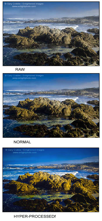
 Pictures: Asilomar State Beach, Pacific Grove, Monterey Peninsula, California. The first is a straight RAW file; the second represents my standard image processing, which took less than 30 seconds, and the third is a “hyper-processed”, highly-saturated image like might often be seen on Flickr.
Processing note; the only other manipulation to these images was a conversion from Adobe98 RGB to sRGB, and a slight hue modification to account for and correct the shift from blue toward cyan during the colorspace conversion process. Click the picture to see it larger. Use your browser’s BACK button to return to this page.
How much is too much post-processing on an image? When does an image cross the line from being a natural representation of a scene to something so processed that it’s now unnatural, i.e. an artistic interpretation?
Much debate continues to swirl around this issue, and involves ethics, credibility, and responsibility. The debate has raged in some form or other for many years, back to when the National Geographic decided to move one of the Great Pyramids of Giza to make the cover look better. Yes, they were nailed to the proverbial cross, and eventually issued a statement promising never to do that again. However, the advent of digital photography and the proliferation of digital cameras has led to more and more people discovering RAW post processing techniques, including things like HDR (High Dynamic Range) techniques.
In the field of nature and landscape photography, more so than in most other genres of photography, except for photojournalism, there is often thought to be an implied or implicit trust factor between the photograph(er) and the viewer. The reason is simple; we expect the natural world to be presented to us, well…. naturally.
Back in the mid-1990’s, when I was working for Galen Rowell, he called several of us into his office one day. He proceeded to throw open a copy of Art Wolfe’s book, Migrations. Galen proceeded to have us take a closer look at some of the photos. He suspected that some of the photos in the book looked too perfect, and that some of the animals appeared to have been cloned. My co-worker at the time took it upon herself to make a bunch of 11×17″ xerox copies of suspect photos, then using a lupe with the book, used colored marking pens to identify animals or parts of animals that had been cloned. Galen was so impressed with her detective work, that he included those xerox copies in his Outdoor Photographer column in which he exposed Art’s previously undisclosed ‘artistic’ manipulations.
The cry for both integrity and disclosure in regards to altered nature photography rages on in many areas, including magazine editors who won’t use a photo if a single branch or leaf has been cloned out of a bird shot.
Even today, the debate continues in numerous circles. On an extreme end, there is currently one person (or small group of people) who have set up an entire web site devoted to attacking an individual photographer, claiming that the photographer isn’t being truthful with regard to how he chooses to render his interpretations of the natural landscape. The basis for their argument is that so much digital post-processing is used that the scene can no longer be called natural. Unfortunately, rather than making reasonable and civil discussions, this person (or group) has made their attacks so personal and vicious that I refuse to name names or post a link here. Nonetheless, as disgusting as it is, it shows the extremes that some people will go to based on their passionate beliefs regarding the need for truth and disclosure regarding nature photography, and the blurred zone leading to “art”.
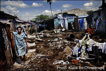
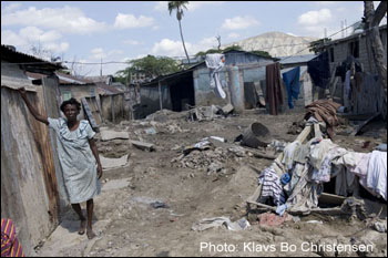
In a more civilized vein, the debates about post-processing are also being applied to photojournalism. Most recently, three photos were disqualified from a Danish photo contest when the judges decided that the photographers had applied so much post processing techniques, that the submitted entries no longer fit the definition of what the thought should be a found natural scene. Here is an example of one of the images in question, showing the finished shot as submitted to the contest, and then the RAW file before any post processing had been applied.
Personally I have a hard time coming down hard on the photographer, since only color and exposure controls were manipulated during the RAW conversion, and nothing was removed, and no visual elements were added to the scene to alter the context of what was in front of the lens. And as color is a subjective perception, and varies in tone and density based on exposure, how can we clearly define when too much is too much, and when is the line crossed? There’s certainly no doubt that with the boosted color and added contrast, the processed image is much more dramatic. But is it still a truthful photojournalistic scene?
Read more of the story and find some heated discussions at:
Photo District News
Pressfotografforbundet.dk
The National Press Photographers Assoc.
Lightstalkers.org
The Online Photographer
So tell me… what do you think? Do you know where the line is? Is it like pornography, where you can’t really describe it, but you know it when you see it? Should the contest entry have been disqualified for being ‘untruthful’? What about nature photography; is there a clear distinction for you when processing takes something beyond a natural rendition and turns it into more of an artistic expression?
Come on… someone’s got to have a definitive answer. Right? Wrong? 😉
Edit: Not long after posting this, I found this image on Flickr as a shining example of a hyper-processed photo with colors saturated beyond belief.
In regards to Klavs Bo Christensen photo, it should have been disqualified just on the grounds of being a bad garish photo. 😉 I actually like his non-manipulated photo better. But more seriously, it’s my opinion any photo-journalism shot should be left untouched including color saturation or exposure control.
In regards to landscape photography, it’s less clear-cut because it depends on the context of how the photo is being used. If it’s being used for a photo-journalistic editorial purpose, let’s say for National Geographic, then it should be left untouched too. But if its being used just for fine art, then I think the photographer is well within his/her rights to manipulate the photo as he or she sees fit.
this is one more discussion that kicks off with a direct association of photography and verisimilitude. as a visual artist who is familiar with other media besides photography, all of which also can be used to present an image with seeming verisimilitude (effects that can be quite startling), i challenge readers to consider the validity of reducing this one aspect of photography to its sine qua non. you may say that hyper-realist works in other media are “photographic”. i would ask you how works produced before the advent of photography could be classified as such.
to tease out the sense from the sensibility in these matters, i suggest it is more profitable to hold verisimilitude in abeyance for a moment, and instead consider intent and context as more salient issues for this discussion. intents and contexts are more absolute and pertinent in this case in determining appropriateness of manipulation, than the exceedingly rubbery aspect of verisimilitude. for an instructive example, look at Diane Arbus’ contact sheet for the boy with grenade photo–a photograph that was not technically manipulated(in the manner of contemporary PP) in any way.
finally, i note with interest an undercurrent in all these discussions that may belie their originators’ protestations of “straying too far from reality”, and that is the thorny matter of taste. taste is the ghost in the machine of art, present but ineffable. most examples i’ve seen in these discussions of objectionable PP use examples of PP done in bad taste. while taste is undoubtedly an issue in art, how is it so in PJ or documentary photography? it can only be so if the objects of same have somehow been aestheticized PRIOR to the application of objectionable PP, and if as viewers we apply an aesthetic condition to these objects, thus enabling us to approve or disapprove of supposedly objectionable PP.
Great post Gary with interesting examples. Trey Ratcliff had a great example on Stuck in Customs of a photo he had disqualified because he used HDR: http://www.stuckincustoms.com/2009/04/22/controversy-tuesday-disqualified-from-smithsonian-and-oprah-grabbin-rights/
It is something I am constantly evaluating. I know when Janine and eye are adjusting photos, we are always asking each other – “Is this too far?”. I’ve gone back and reworked large groups of images because I decided later that they were either over saturated or under saturated.
To answer your question, I would have done a little more then your “normal”
Ron
I like your normal version best Gary.
As for the image in question I would say that is too far for a photojournalism image. It’s beyond a matter of “photographing what I saw” since there is a thick black tone to the dirt that is clearly not possible in the type of lighting that was present in the original image. The processed image might look better but crosses into the manipulated category IMO. Over-baked would be the best word I can describe that as.
I’m not a fan of over-processed shots. Like the other commentors, I like your normal one the best, and IMHO, the RAW image of the second feature is also better. It has a dirty look that is real and dramatic. It didn’t need all those “enhancements.”
I’ve only started using Photoshop, and with just the basic level, I don’t do too many things, maybe just enhance the color or contrast. I don’t have a polarizing filter so the skies in Southern CA are often an issue for me.
Over-processing often times looks fake. I don’t want my photos to look fake, but real.
Interesting article. Whenever I work on individual images (rather than batch processing) I am amazed at how quickly you can destroy an image by just cranking up the saturation dial a tad too much. Personally, I don’t like these over-saturated, over-manipulated, completely over-the-top processed images. (Whenever I encounter a situation in Photoshop where I think “ouch – that’s too much” I reduce the additional saturation by at least 50%, which usually works.)
For me, a photo should look natural, with a tendency towards well-balanced saturated colors.
Great post, Gary. Regarding your three images. If you had shot that scene on Velvia 50, what would it have looked like? My guess is image 3 is the closest. How can shooting Velvia be called natural and shooting RAW and post processing be called manipulation?
– Dan.
Dan,
I think the key difference between photoshop and velvia is that the level of manipulation is so different. Give Velvia to two photographers shooting a beach sunset and they’ll come back with similar looking prints…give a digital SLR to two photographers, have them shoot the beach and then have them edit their images, and they may come back with two strikingly different images.. It is all manipulation, but there should be a limit to what is considered natural, and what is considered “photo art”.
Gary,
This is a tough question to answer. And I don’t think that we can ever objectively approach this. What a scene looked like to the photogrpaher at the time never looks like what the film or even a digital camera can capture. I was reading some quotes today from Galne Rowell as I needed to make a point about a post I made on my blog and ran across this: “One of the biggest mistakes a photographer can make is to look at the real world and cling to the vain hope that next time his film will somehow bear a closer resemblance to it.” and this “I began to realise that film sees the world differently than the human eye, and that sometimes those differences can make a photograph more powerful than what you actually observed.” what I got from these is that film or digital is a degree removed from reality. In my post processing, I try to bring the phot to a level that conveys what I experienced while I made the photo. Each time the post processing is different depneding on what it calls for. Sometimes saturation needs to increase, sometimes the opposite. Sometimes it needs more contrast and other times less. I only work with what is already in the photo and I do my best to keep the adjustments from letting the final image leave the realm of reality. I’ve never had some one say about one of my prints that it did not look “real”. Now being someone who spends a lot of time out in the natural world, like you, we can tell whn some thing has gone just too far. If the person presenting it is not forthcoming but is trying to present it as reality then I think we have a problem.
Regarding your three images, the middle one looks right to me. The Christensen photo to me has gone to far.
Thanks for all the comments so far.
@ Dan, no, I can tell you from my many many years of shooting velvia, that even that saturated film color palette doesn’t get anywhere as far as the third version. If you look on my web portfolios, where there is a mix of 2/3 film to 1/3 digital, you can see that I’ve made a point to keep my digital processing to be about the same palette rendition as velvia, without going too far overboard.
I do agree that the entries go too far for any journalistic integrity, but it does cause me to ponder how close is one version to a particular film palette, and the other version to a different film palette.
@ Youssef: One of the biggest themes of Galen’s workshops was always learning to see like film, and how that was different from our eyes. And until we learned to speak or understand that different language, the results of our photography would always be disappointing. You had to know, when looking through the viewfinder, how the film palette would render the scene in front of you, and how that would be different from the physiology of your eyeballs & brain.
I also just read elsewhere a comment that (akin to setting all the RAW controls to zero) Ansel Adams was known for saying take an average photo of an average scene with average processing on average paper, and you’ll wind up with an average photo. Something tells me Ansel wouldn’t have left his RAW defaults set at zero.
Classic discussion Gary, and there is no answer. I tend to come a little too close to the colorful line sometimes I think, though not so much that it’s fake. People often mistake my prints for paintings, and to be honest, I actually wish they were paintings. Then I wouldn’t have to deal with answering their never ending questions ‘so, how much did you photoshop this? is this even real?’.. even for images with very little manipulation. People just assume that a good looking photographed is photo shopped these days. Maybe I’ll start printing on canvas and apply some clear lacquer to simulate brush strokes, and then I can just say they are paintings. But… I like that fact that photography has a direct connection to nature, I think it enhances the emotional impact. So the battle between artistic expression, and photographic truth continues.
Good article, Gary. I just entered a photo contest and looked at some of the other entires online, and was aghast at what some photogs seem to consider “good” photography. There is a line, i believe, that is crossed quite often. I remember the first time i saw an Art Wolfe exhibit and i was shocked at the amount of ‘alteration’, but there it was, covering a whole wall to be admired by the adoring public (and im actually a big fan of Wolfe) so im pretty sensitive to the issue. Fortunately, we have places like NPN where there are plenty of sharp eyes to keep you honest and clean! 😉
In the case of the photo above I actually think the Raw version looks alot better. The final version just screams over processing and would have disqualified from most photo comps. When you move a photo to unrealistic it isn’t really a photo anymore.
I find the discussion or debate fascinating in one regard. When the standard is photojournalism, I think most of us will agree that any image manipulation is inherently dishonest. But is most nature or landscape photography meant to be photojournalistic?
I personally believe many of those who object to any significant degree of post processing are “graduates” of transparency film photography and have little, if any, experience and training in the art of manipulating the image from a black and white negative into a print. In fact, most of the great B&W photographers “post processed” their prints to alter exposure and contrast in localized areas of the print to achieve a result that the dynamic range of the film could not. Transparency film, however, is WYSIWYG (What You Shoot Is What You Get). To a very large extent, that is also true of negative color processing as well.
Digital photography. however, has freed all of us from the limitations of color transparency and negative materials. It not only makes it possible to exercise image improvement with color images in ways hitherto accepted in printing B&W prints, it makes it far easier than it ever was with B&W printing.
However, the larger debate, in my opinion, centers around whether photographs should show the natural world the way the camera saw it, or the way the photographer wants his viewer to see it. The latter is obviously an artistic decision, but how many in contemporary photography do not realize that great B&W photographers have been making that artistic decision for a long time?
Wouldn’t it be better if we were to simply avoid the categories and simply view all images from the perspective of whether we like it or not? And if not, then move on to the next image and make the same subjective evaluation. Because, in truth, every image will find some who will like it, and every image, no matter how grand, will find some who will be less than impressed with it.
When I was in the military, the sergeants would sometimes tease new recruits by asking questions they knew could not be answered, then yell at them demanding a definitive response. A common one was “why does a rabbit when it runs?”
The answer here is of course that it depends on the context and the intent. Without it, the question itself is pretty meaningless. Too much for what? compare to what? for what purpose? in whose opinion?
Might be some merit to being strict in the name of photojournalism, though a visual message can just as easily be distorted from “the truth” by composition (inclusion or exclusion of elements), perspective, and any number of other “legitimate” tactics. For artistic use – who cares? It’s like judging the literary quality of a novel by the font it’s printed in.
http://guytal.com/wordpress/?p=106
Guy
I can not say that this is a subject where I’m heavily involved in, or should I say heavily vested in, but I think it is fascinating how hard it is to get an answer.
If anyone ask me I would say that I eg. expect National Geographic to have “truthful” images. I do not expect them to not adjust tone etc in the photo, because we all know that the act of capturing an image itself is modifying the way things look at the place. Camera (film), lighting and many many more things are influencing the way the image is.
I might actually think, for a truthful image, that Klavs’s image above is “too much”, but not everyone will agree (and probably not Klavs).
Not so long ago NGM blogged about taking an image at Stone Henge and they presented two images – one posted on Flickr and one done by a NGM photographer.
http://ngm.typepad.com/blog_central/2008/10/the-pro-advantage-part-i.html
The NGM photographe, Ken Geiger, has blogged on the whole process of taking the image. I like his resulting image and found reading about the process very interesting:
http://ngm.typepad.com/blog_central/2008/05/shooting-stonehenge.html
I do not know if “heavy post processing” has been involved in this picture, but in many ways walking around with a flashlight “paining the colors” onto the stone over several minutes itself is a “heavy processing”.
I wish I could do this picture as well as he did, but would it be less “truthful” to take this during the day and play with the colors in PS afterwards .. if the result had been exactly the same?
Martin
About your RAW example, I’m not sure what you mean. RAW means no processing applied AT ALL, meaning that it can’t be displayed. In order to display a RAW, you need to apply a processing anyway, and chose the parameters of this processing. I think you should have said which parameters these were, and which ones were modified for the second and third photo.